The power of wallpaper is truly realised in this home on Auckland’s North Shore, where colour and pattern define spaces and turn walls into artworks.
Meet + Greet
Sarah Sheild, 46 (co-owner of Paper Room), Chris Sheild, 49 (IT project manager), Izzy, 16, and Fletcher, 14, plus Missy the moggy.
In early 2013, Sarah and Chris Sheild decided it was time to move on from their beloved 1960s family home and find somewhere new with more space for their growing children. After selling their home of seven years, the couple rented during a disheartening and frustrating nine-month search that was complicated by some non-negotiable criteria – they needed to remain in the Westlake school zones, and they required a short settlement as their rental term was up. To make things worse, the city’s housing market was on the rise.
At the close of that year, Sarah spontaneously went to the auction of a house they’d viewed five months earlier when it was on the market and hadn’t sold. This time, she won the auction.
“We weren’t in love with it but we were slightly desperate and conscious of the rate at which the housing market was going up,” explains Sarah. “The house ticked a few boxes – it was in the right school zone, it was newly renovated and felt like a new home, and there was nothing offensive about it.” Plus, all the walls were painted white, so it was a pristine backdrop on which Sarah could unleash her imagination and flair for design.
Sarah – co-owner of interiors business Paper Room – has used wallpaper throughout her home, but she has carefully selected the patterns and locations so that the viewer is able to appreciate the effect without being overwhelmed.

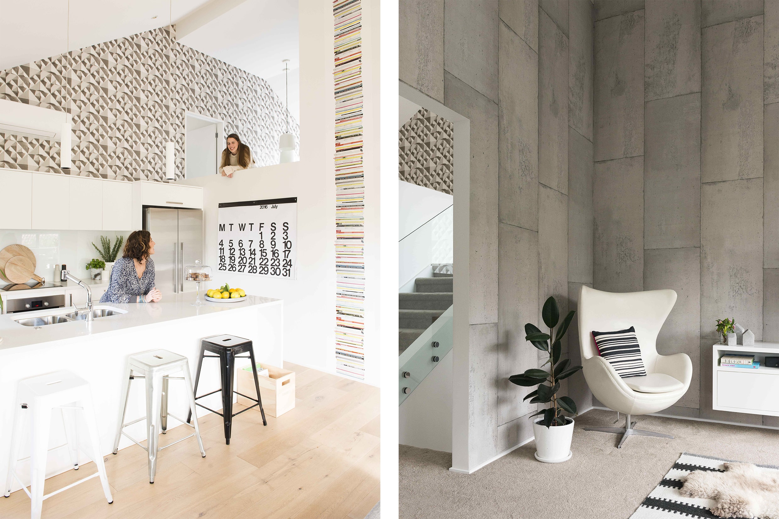
Entering the home, the eye is instantly drawn to a striking grey-and-white geometric paper (‘Geometric Relief’ by Ella Doran). This paper covers the largest wall in the house, which spans two levels up to the first-floor kitchen. “You can see this wall from all spaces on the living level, so it means all the other wallpapers on the same level have to work with it,” explains Sarah. Not wanting to have just one wallpaper in the living area, Sarah has treated her walls like artworks, and some of the papers she selected have been handmade by artisans revered as icons in their industry.
Sarah’s favourite area to decorate was the family room. “We have really high, angled walls and ceilings in this open-plan space and I knew we could make the most impact by using wallpaper.” With so much choice at her fingertips, she took her time before finally opting for a Piet Boon design called ‘Concrete’.
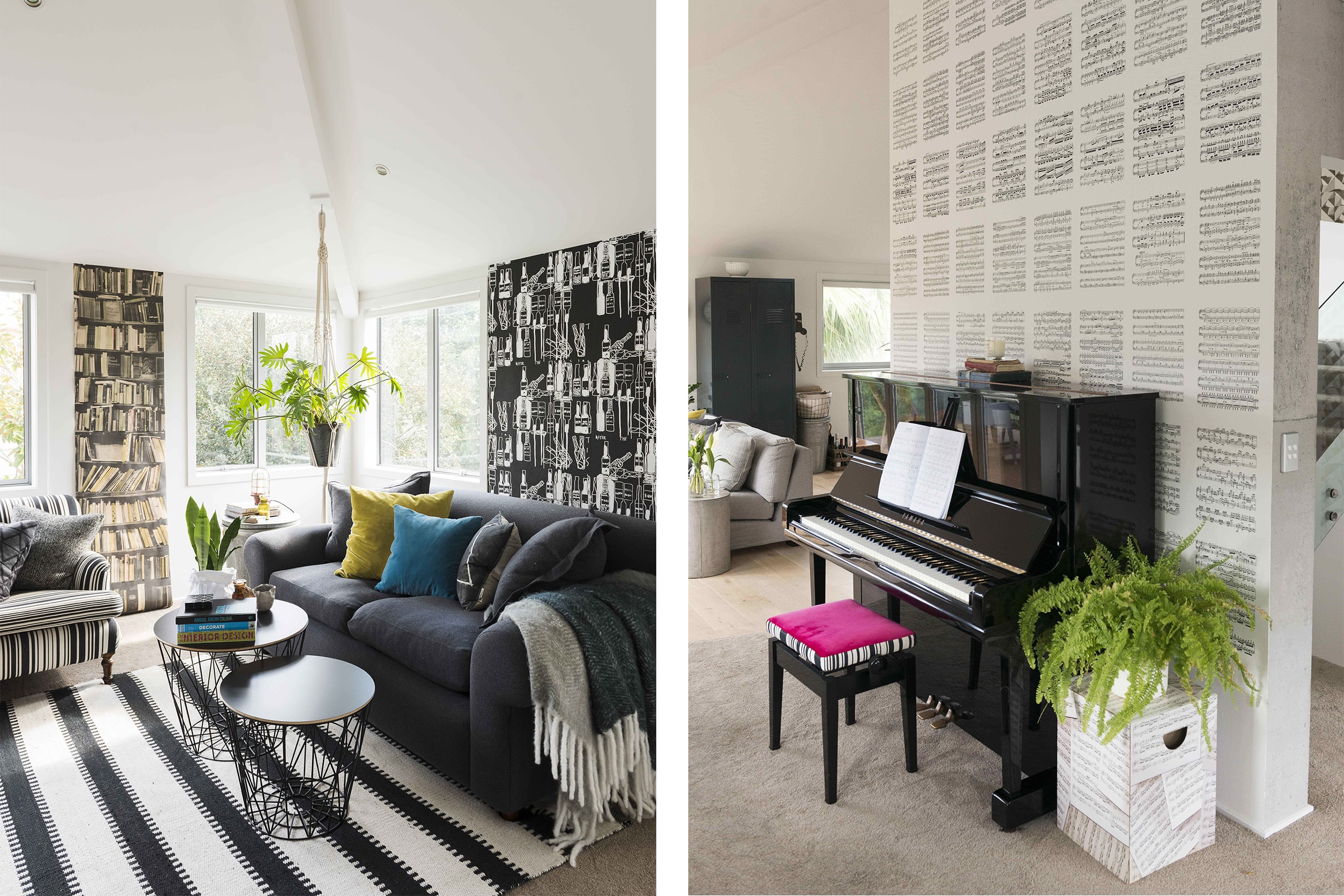
“By treating the other wallpapers in the living space like artworks, I got away with using three very different papers in the one area,” says Sarah. She used a digital moodboard – a tool she uses for all her interior design clients – to isolate the tones in the three wallpapers and use them as inspiration for her soft furnishings, ensuring a cohesive overall look in the room.
The contemporary kitchen and bathrooms were newly completed when the family purchased the house and fortunately the previous owners had chosen to stick with a simple white palette. Wanting to bring a little attitude to these snowy expanses, Sarah decided to hang a series of quirky and colourful paper panels. ‘Peacocks’ by French design house Bien Fait is on display in the guest bathroom and toilet, completely transforming these small spaces.
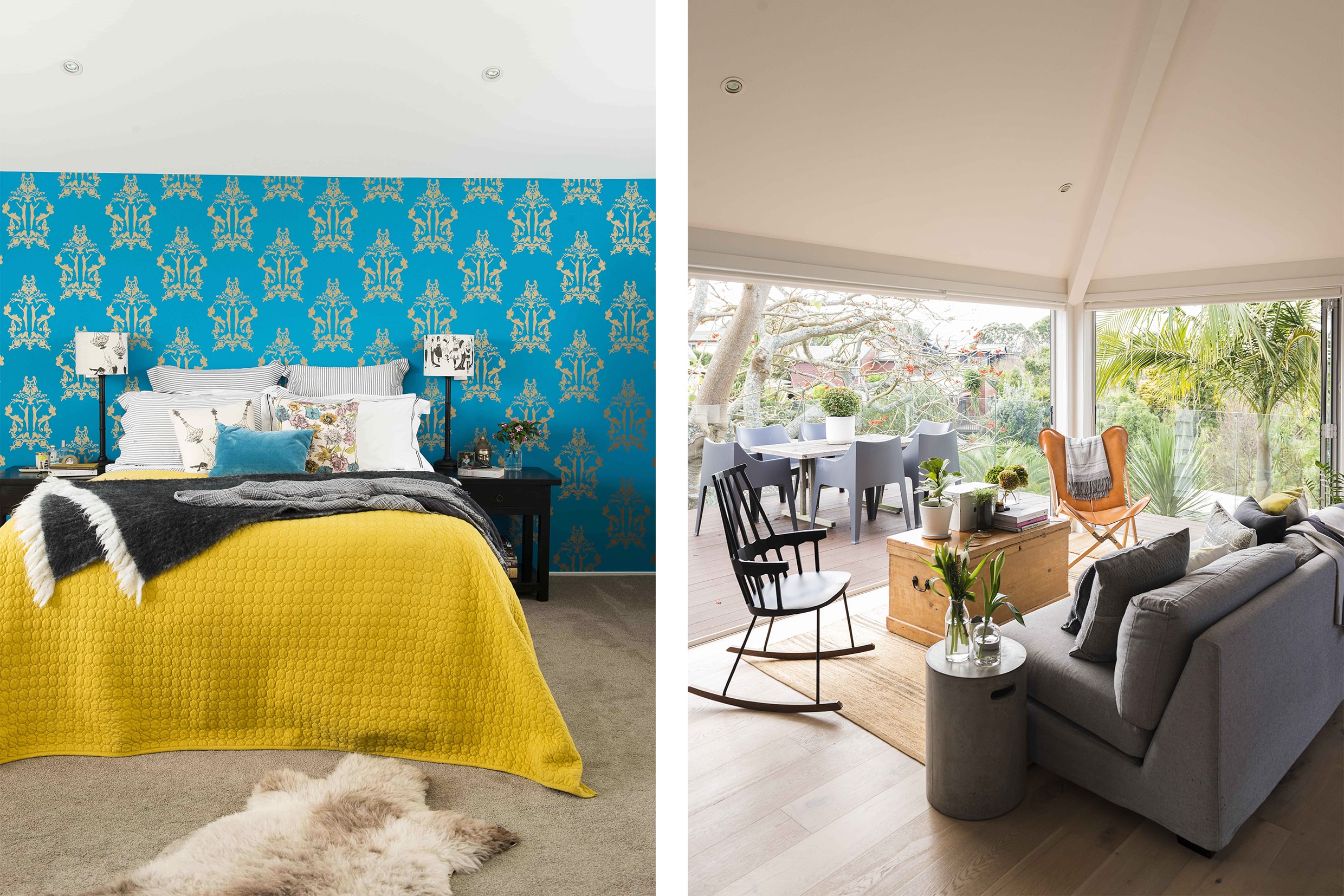
An eye-catching wallpapered backdrop of turquoise and gold (‘Anakreon’ by Go Home) makes a bold design statement in the master bedroom and forms a striking contrast to the geometric paper found on the wall outside this room. To create a connection with the adjoining ensuite, Sarah hung a matching strip of the same paper in there to break up the otherwise all-white space.

The house is situated down a right-of-way on a small, low-maintenance section. It is surrounded by a number of other homes, but the previous owners and those of neighbouring properties had the foresight to plant generously, ensuring plenty of privacy. Although it wasn’t the couple’s dream home, it did have some alluring features – namely the high stud and angled ceilings in the living areas and master bedroom that create a sense of scale and space.
Another drawcard was the well-established flame tree next to the upstairs deck, which offers privacy as well as shade during the warmer months. “The lush green leaves become part of our interior when we open the bifold doors,” says Sarah. “The deck extends out from our kitchen and living area and essentially provides another room.”
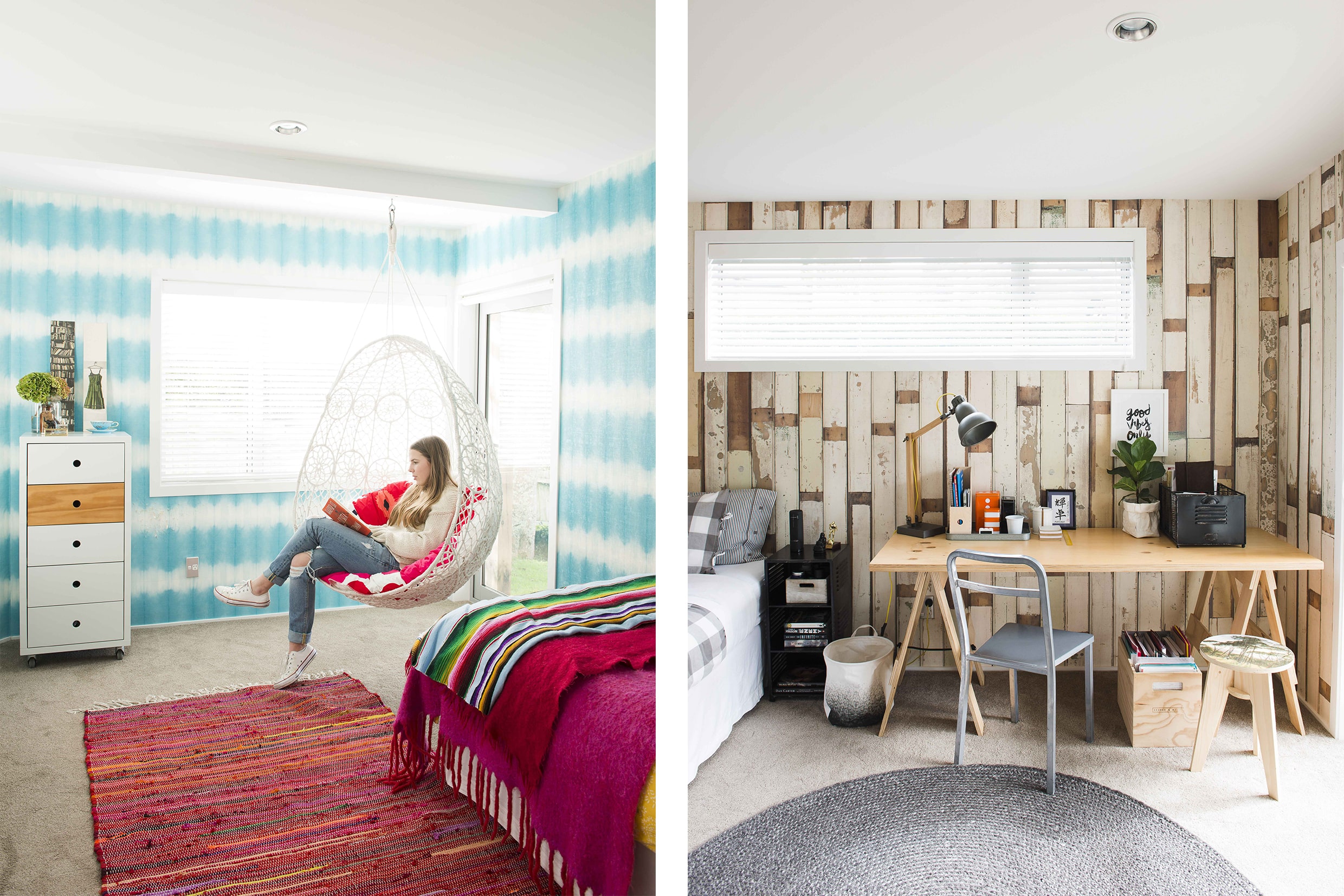
Fletcher and Izzy’s bedrooms are situated downstairs. Izzy’s bedroom is a colourful and energising space that has been decorated in turquoise ‘Savine’ wallpaper by Designers Guild. The paper’s blurred stripes contrast with the hot pinks, reds and oranges in her rag rug, the throws on the bed and the Marimekko cushion on her hanging pod chair.
Fletcher’s room has a more subdued palette. On all walls the realistic ‘Scrapwood’ wallpaper creates an illusion of old demolition timber. A muted mix of grey checks, stripes and plain fabrics covers the bed, adding to the rustic charm. A trestle table along the wall holds a lamp that acts as both a desk light and a bedside reading lamp, while a round charcoal Armadillo rug anchors the room.

As you walk around this light-filled house you will be surprised. What looks like a bookcase in the lounge is a panel of Deborah Bowness’ ‘Genuine Fake Bookshelf’, while in a corner of the kitchen, a pile of fashion and design magazines appears to be waiting to be studied. The horizontal hand-screen-printed ‘Fork’ by Tracy Kendall is another unexpected addition. The house, as well as being very liveable, is a lesson in what can be achieved on a reasonably limited budget with great imagination and flair.

Text by Annick Larkin. Photography by Helen Bankers.
29 Jan 2019

