Covenants on new subdivisions can be limiting, but the owners of this Christchurch new-build managed to turn all the restrictions to their advantage.
Meet the owners
Karyn Baylis, 39 (teacher), Adam Baylis, 36 (builder and director of Baylis Exclusive Homes), Luca, 6, Flynn, 4, and Hudson, 2.
Timing is everything
When the new building sites that border the Waitikiri golf course in Christchurch’s Prestons subdivision were released in 2014, Karyn and Adam Baylis were expecting baby number three. They had already decided their current abode was no longer suited to their growing family, but they loved the aspect of this home they’d built two years earlier.
“Our previous property backed onto the Halswell Domain. We loved living on a suburban street and having such a beautiful green outlook,” Karyn says.
Adam had already completed two building projects in the prestigious Prestons development, so he was one of the first to hear about the new, limited-in-number sites. This frontage was very tempting, say the couple, and having family nearby was an added attraction. “Adam’s parents live on the other side of the golf course, so being in the same vicinity made good sense,” Karyn says. “It’s great to foster family relationships by being close. My parents live in Timaru so we created a special space for them and they come and stay often.” The guest suite at the front of the home is removed from the boys’ rooms upstairs, offering grandparents respite and peace when needed.
Design... and build quickly
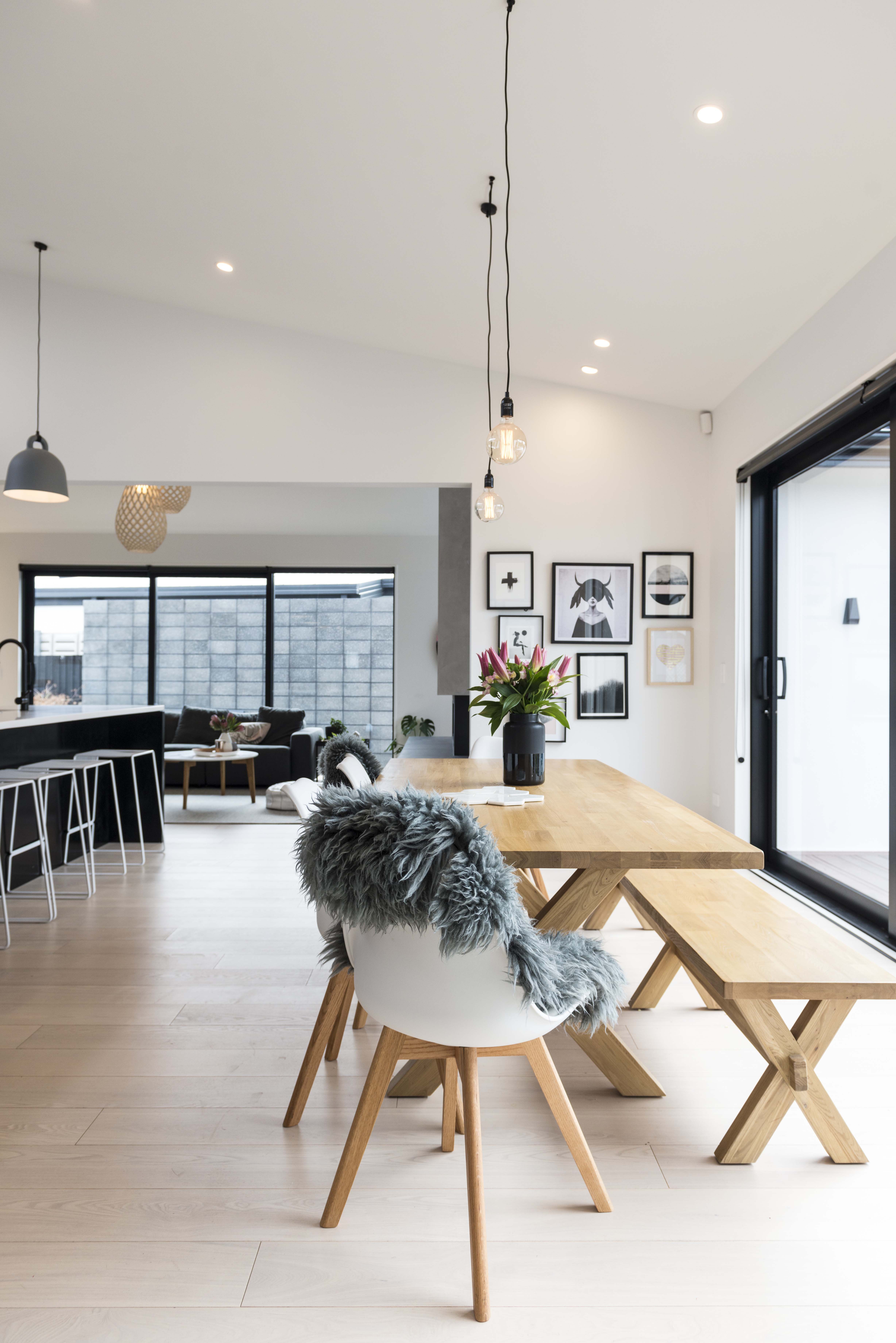
Karyn knew exactly the design layout she wanted and invited architect John Curtin to translate her drawings into working plans. Adam and his crew pulled out all the stops to build the six-bedroom, four-bathroom and three-living room home in just five months. Construction included an in-ground pool in the back garden.
Karyn was impressed – but not altogether surprised – by the speed of the build. “There were some hold-ups with the title which delayed the start. Adam had it in his head that we would be in by Christmas. He started work in August 2015 and we moved in on Christmas Eve,” she remembers. “It was all go. In the final days it was like The Block. The street was lined with tradesmen’s vans and everyone was everywhere,” she laughs.
Creative design solutions
New subdivisions often come with covenants applied to the land which govern what can and can’t be done, and this case was no exception. However, Karyn and Adam simply embraced the restrictions to create a living environment perfectly suited to their family.
“There was a 15-metre building setback from the boundary, so we used that expanse for a swimming pool,” Karyn explains. A clause precluding two-storey structures didn’t prove too much of a hindrance either. “I found a loophole that allowed for a loft, so I kept emailing the developer, asking him to clarify the stipulations.”
Karyn’s persistence paid off. She discovered the ‘loft space’ could be made accessible by an internal staircase, interior walls could be lined and the space divided. The only real limitation was that there could not be any windows in the exterior walls, but skylights were perfectly fine.
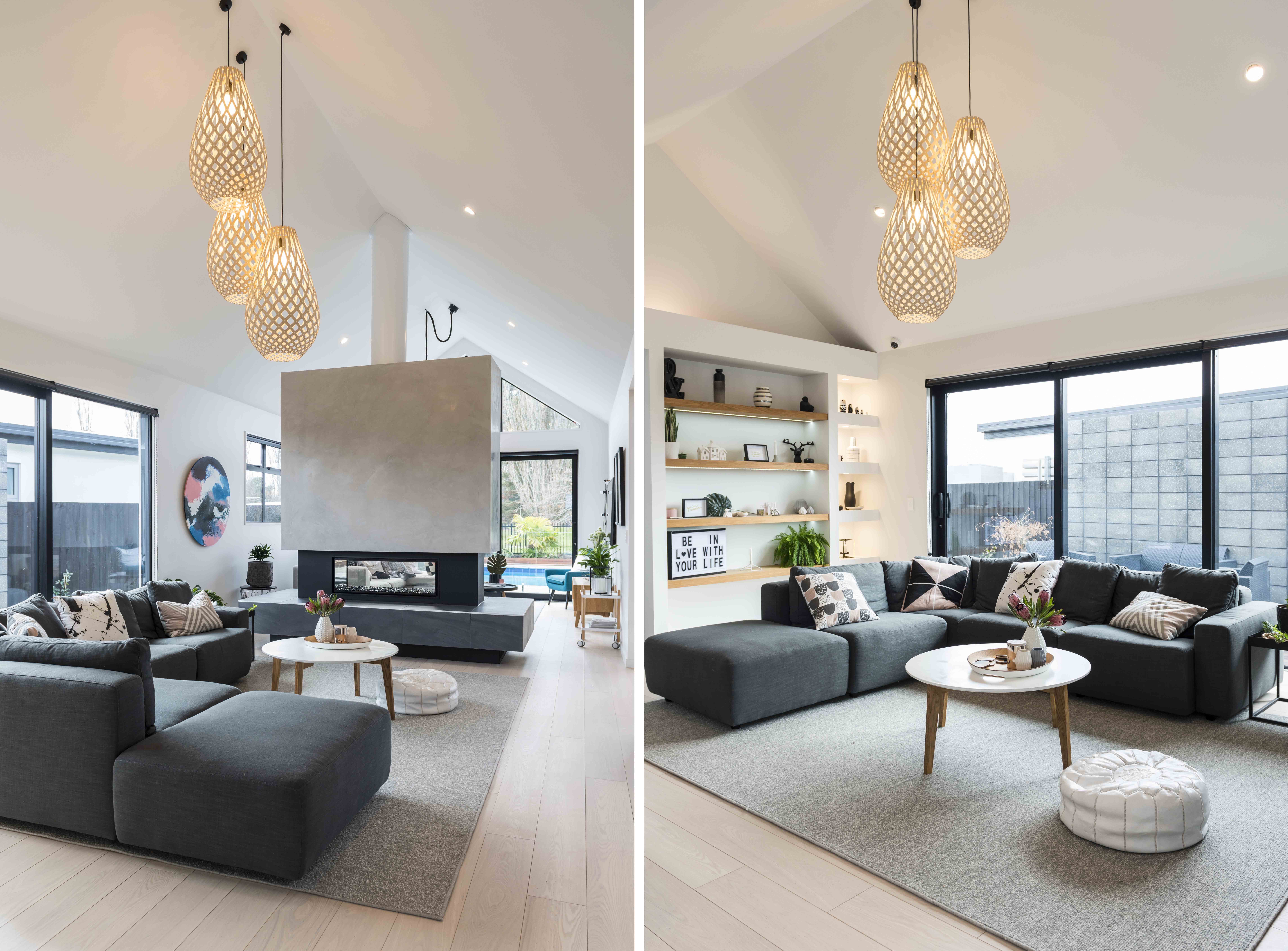
The result is an upper level with three bedrooms, bathroom, storage and lounge area. The high-pitched ceilings add interest and volume, and in-built shelving and cupboards ensure irregular spaces are well utilised. Best of all, the reversible timber windows in the roof of the loft rooms are a big hit, especially with the boys, who love standing on their beds and looking out of them.
“I like to see a single colour and style taken throughout the interior and exterior.”
Irregular by choice
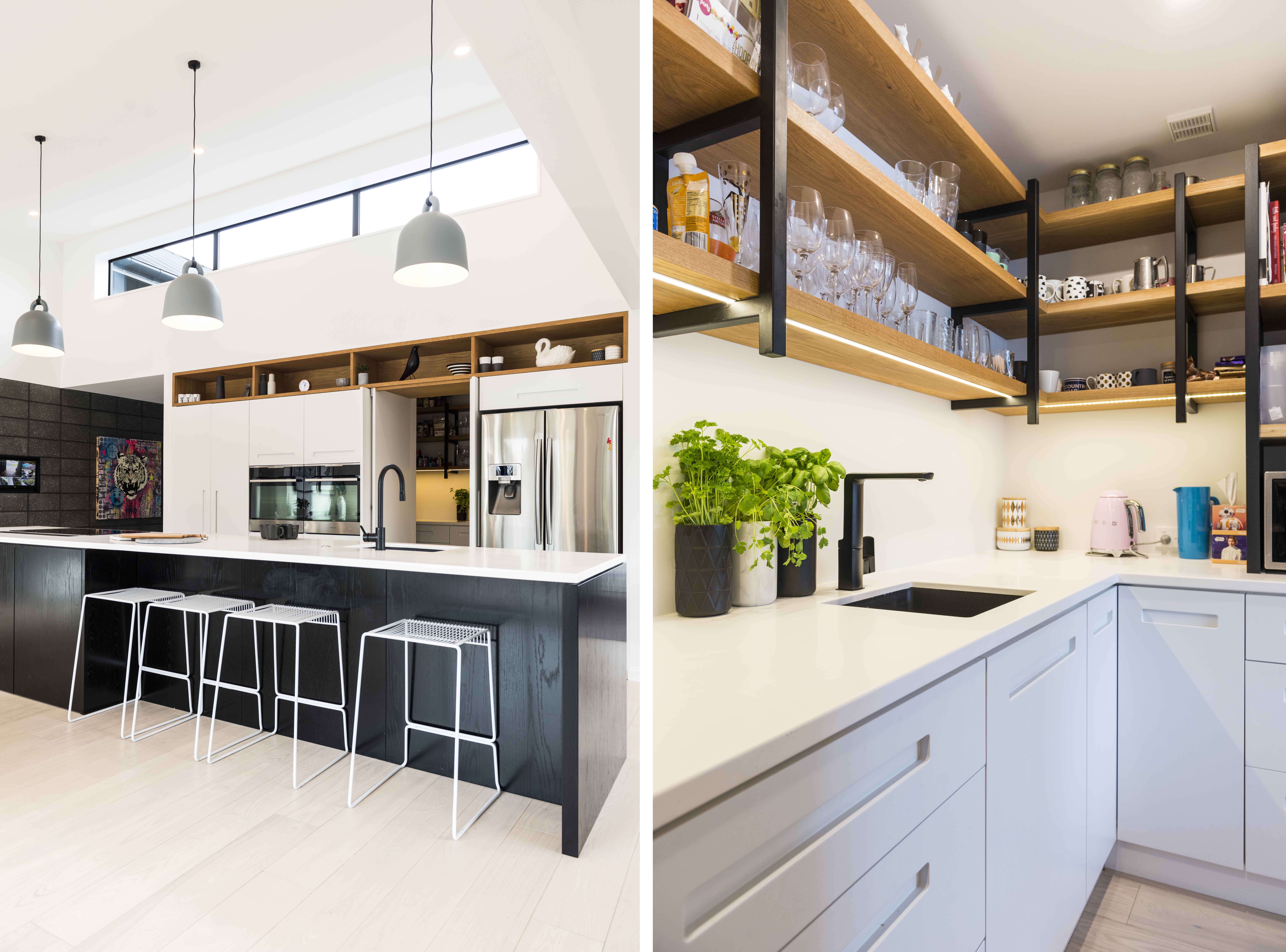
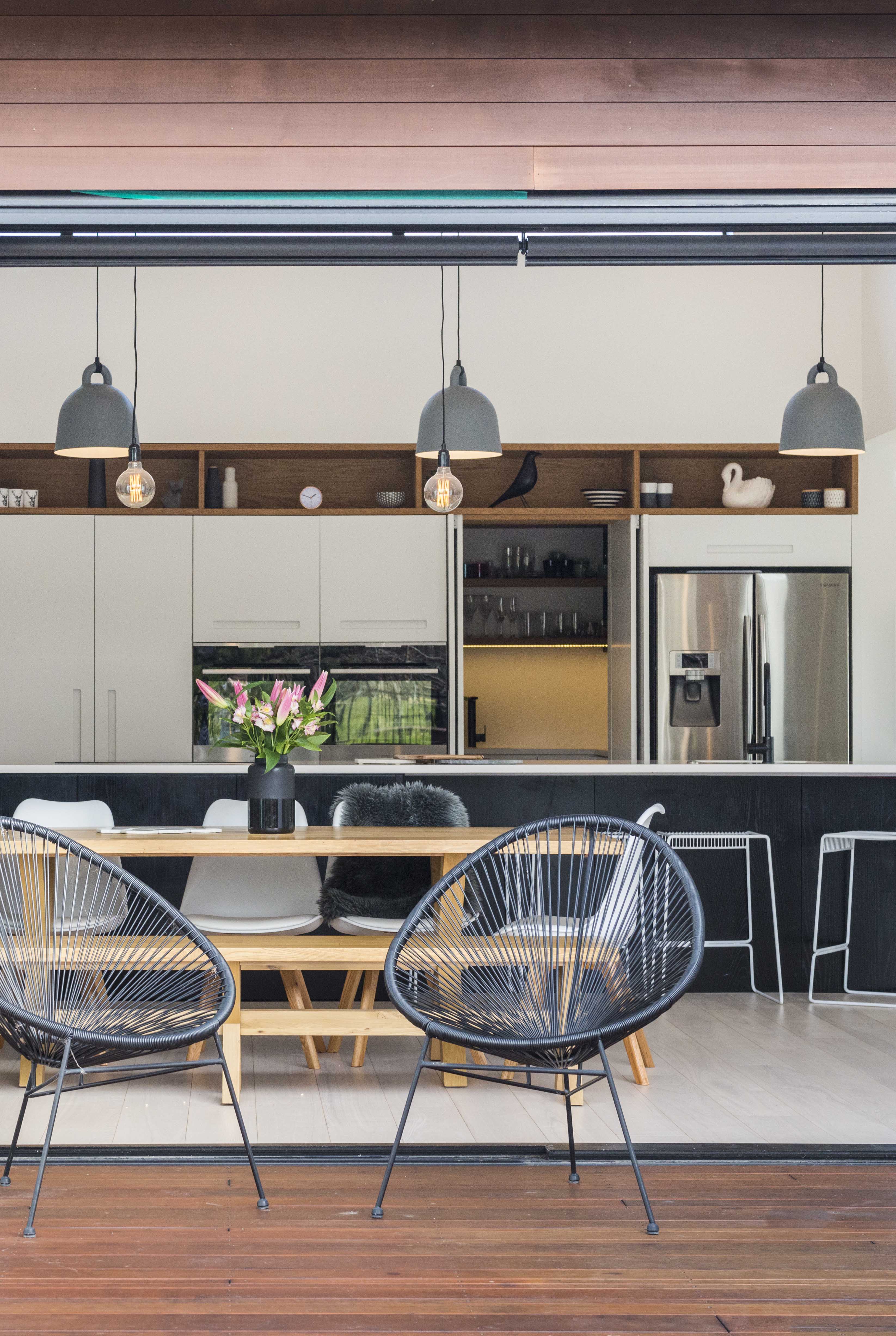
Having already renovated one home and built and decorated two others, Karyn had some well-honed design rules. The choice of black and white for the interior was one decision not open to discussion. “Adam wasn’t keen at first because he thought it would look like a hospital, but now he’s a total convert.” She used pink accents and wood for warmth, and says consistency with colour is key. “The rules are obvious to me. I guess I’m a little bit OCD!”
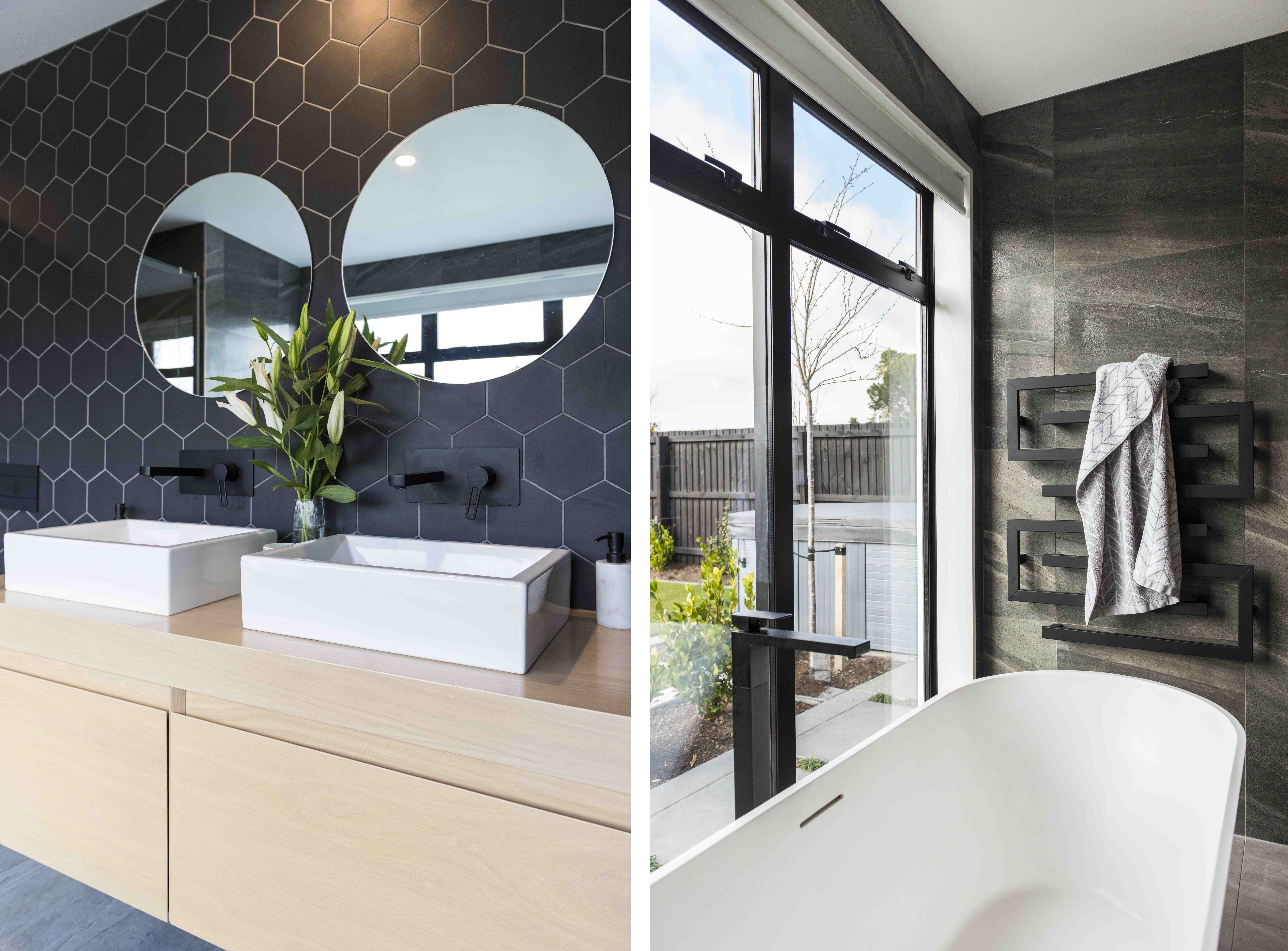
Throughout the home and garden, the shape and profile of claddings, tiles, decking and special features have been randomised to suit Karyn’s preferred style. “I love irregular shapes and patterns,” she says. On the deck, kwila lengths vary; concrete surrounding the pool has been cut in irregular rectangles; interior tiles come in random shapes and sizes.
Another Karyn-inspired design feature is textures and colours repeated indoors and out. Pink accents can be seen in artwork and cushion covers, and concrete blockwork for interior walls has been replicated in the garden. “I like to see a single colour and style taken throughout the interior and exterior,” Karyn says.
I can see upstairs, into the lounges and out to the pool and golf course beyond. It really gives me a sense of being in the middle of my own home universe,” says Karyn.
Karyn’s top tips
- Reindeer hides shed hair when placed in the sun or on a floor that has underfloor heating. Avoid this by draping hides over furniture during winter months, out of direct sunlight.
- Try not to compromise on features that are at the top of your wishlist. Compromising on high-priority items will annoy you for ever.
- Spend on the things you love and don’t be swayed by trends. If you love something, get it and make it work for you.
- Don’t be afraid to experiment and embrace budget alternatives for interior fittings. I picked inexpensive lights for the front lounge and bunched them together to create a special effect.
- Black nail polish is amazing for touching up chips and scratches. I use it all the time.
- If you have chosen a black sink, recess it under the benchtop or you will be forever cleaning it.
Karyn’s style file
- I love Scandinavian style with a twist. I like edgy and cool with lots of white and black. Nothing too pretty, but hints of warmth like wood and pink.
- Matte is in and gloss is out. Kitchen cabinets and floor tiles have been specifically chosen for their matte surfaces.
- I like to support local manufacturers where possible. I have a social conscience and avoid buying rip-offs.
- We have built twice now so I have a strong sense of what I like and what works. I look at a plan and visualise walking through the space. When I go shopping, I know exactly what I want.
- My inspiration comes from magazines, Instagram, Facebook and my brother. He is really into design and lives in Sweden so is well aware of coming trends.
Words by Ady Shannon. Photography by Kate Claridge. Images and story courtesy of Your Home and Garden Magazine.
30 Oct 2018

