When tackling a home renovation project the interior alterations can quickly become the main focus. Given it’s where we spend most of our time, this is understandable.
But – especially when it comes to selling a property - the front of your home is just as important. A well-presented frontage creates an impact. It feels inviting and sets the tone for the rest of your home.
Home buyers and sellers alike will agree that first impressions count. It can be difficult to see past a neglected frontage.
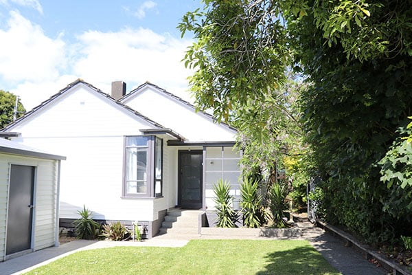
In Kelly’s case, the home she purchased was a real fixer-upper – particularly the front yard. Here Kelly explains how some serious elbow grease, and a few cost-effective tricks, added instant street appeal to the property.

Finding your perfect ‘ugly duckling’
As first home buyers on a budget we were realistic about what we could afford. We wanted a home with good foundations, situated in a great location and one we could make our mark on.
We found a former state house that ticked these boxes and more. The property had a generous section, solidly built with native timber and space to raise a family. It had the potential to be a home we’d enjoy living in for some time, which was key.
Figure out what you’ve got to work with
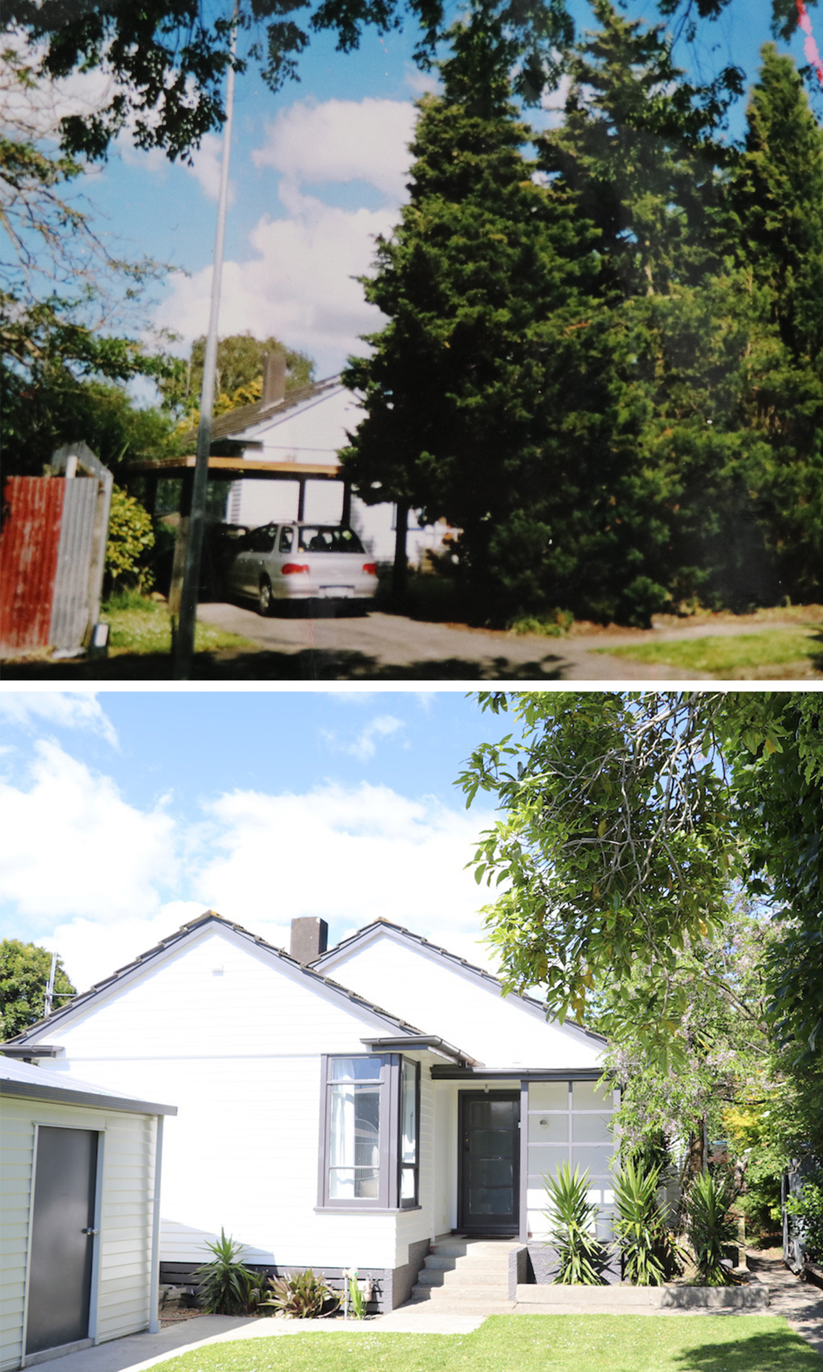
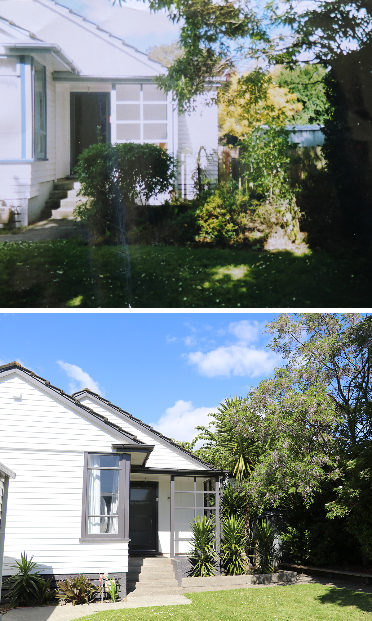
The front yard left little to be desired. From its rusty and derelict carport, to the unplanned and overgrown garden - we knew we had our work cut out for us.
We tackled the front yard by clearing everything out, essentially creating a blank slate to work from. I recommend this approach as a great opportunity to step back and view the cleared space before devising a plan of action.

Bring in the pros if needed
The first to go in the gardens were four overgrown poplar trees situated in lieu of a boundary fence. While we loved the established greenery, at over 10 metres tall we knew they would become problematic in high winds near the power lines. Not to mention all the natural light they blocked to the front of the home.
We paid for tree removalists to come in, cut them down and grind the stumps. Definitely worth the $600 fee to have the professionals undertake this job.
We created low-level garden boxing and introduced simple, low maintenance planting and additional established trees to create instant privacy from neighbours along the side fences.
Think about changes that add value - like a garage
The derelict carport was on its last legs and needed to go. In its place, a kit set double garage was built. This provided much-needed additional storage, something our former state house lacked.
Concrete was laid for a new driveway and pathways introduced from the gate and side garage door to the front door to help create a modern and tidy look.
Security, privacy – and a touch of style
Adding a fence doesn’t just provide security and privacy, it also helps define your property from the street.
By clearing the oversized poplar trees, we were able to build a fence right along the front, either side of our garage to secure the property. Consider how the fence may look as it ages, and how much maintenance it may require.

Freshen up with paint
The home had flaking paint that desperately needing freshening up. Originally white with light blue trim, we felt this colour palette left the house looking washed out.
We wanted to creative a cohesive look by tying the house, garage and gardens together. We chose to repaint the weatherboards Dulux Weathershield in White. For the fascia and bargeboards we instead opted for a dark grey with Dulux Grey Friars.
It’s amazing the difference a fresh coat of paint can make to the overall look of a property. It’s a great budget friendly makeover option. The fence was originally stained brown when built but after painting the home's exterior, it no longer suited.
I wanted to make an impact and transform the old, tired fence. I considered painting the fence black but wasn’t entirely confident with my choice. I’ve worked with the Dulux team on a number of projects in our home and their colour experts encouraged me to take the leap and paint it in Timbacryl Ebony.
While it was tedious and time-consuming job, the final result was definitely worth the time.
Kelly Evans is a blogger, writer and stylist. Kelly shares stories on clever people and great design on her website, thehomescene.nz. Click here to read more from Kelly.
All images courtesy of Kelly Evans, thehomescene.nz
03 Jan 2018

